How to Build a Design System : Atomic Elements
December 1, 2020 4:59 pm | by Mohit Bairwa | Posted in Tech
Introduction
If you follow these articles, in my last blog I shared my design journey and discussed some UI design fundamentals. However, we don’t design large applications using those limited fundamentals. There is more to learn before we start designing fancy screens to add to the Dribbble portfolio or to the Instagram page.
The UI Designs will be used in real-life products/applications and will not forever sit in Figma or XD. To make this process of designing a large number of screens for a big application smoother, we use something called Design Systems.
What is a design system and why is there a need for it?
Just like programming languages adhere to coding conventions, a design idea also follows some rules and guidelines. These rules and guidelines form atomic level building blocks for designs and help in building a robust design with reusable components and much more. Some popular design systems are Carbon Design System by IBM, Google’s Material UI, Atlassian Design System, Fluent by Microsoft, etc.
Design System != UI Kit
If you are working on a small project consisting of four or five screens, then you probably don’t need to build a design system. Fully functional applications benefit from a design system (existing or new), it makes your designs more manageable, consistent, and the process less time-consuming. A design system also enables multiple designers to contribute and work together on a single project to obtain design consistency.
How to create a design system?
It’s crucial to understand the building process before you start working on the project design. The process has three atomic building blocks:
- Text Styles (typefaces and type scale).
- Colors (full-color palette with all shades).
- Spacing guide.

- Text Styles
- Colors
- Spacing Guide
- Spacing blocks
- Grid System
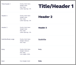
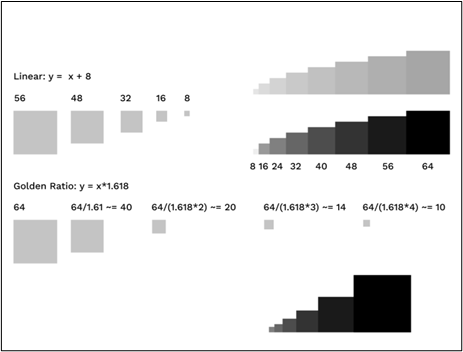
Text styles consist of two elements: fonts (one or two) and a type scale guide. Instead of doubling the font size, you should always follow the golden ratio to build your type scale. For example, if the base font size is 16pt, then multiply it by 1.62 (golden ratio up to two decimal points) for larger sizes, and divide for smaller font sizes. Once all the type scales are fixed, draft a document like below for other designers in the project.
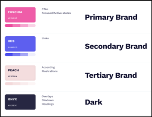
Just like text styles, you must define the colors for the design as well. Generally, there is a primary color, a secondary color, and a grey palette with various shades. After this, document the color styles like the following example.
The spacing guide has two sections, the first is spacing blocks and the second is the grid system.
You need one more atomic element to start building molecule-level components: spacing. Take the help of the golden ratio to make the spacing guide, selecting a base value and multiplying it with 1.62. Another way of building a spacing guide is linear, as shown below example.
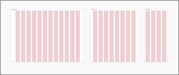
With the help of these spacing guides, you can build a grid system to set guidelines for responsive design and use a grid for designing complex layouts.
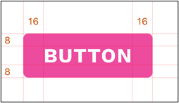
Now that we’ve been over the fundamental building blocks, you can start building UI components. For example, let’s create a button and it’ll be a molecule component. To design a button, you need information like the text style, foreground and background color, and padding (spacing) from the design system.
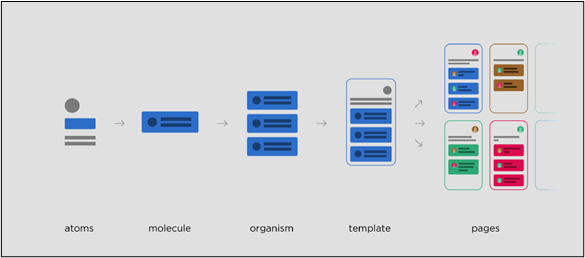
You can create multiple instances of this button component for different component states (:hover, :focus, :active, selected, disabled, etc.) using the color palette. With the molecule level components, you can produce organisms like cards, navbars, tables, sidebars, and then develop templates and pages using these organism components.
Over to you.
The design system is the backbone of every UI design idea of a project. It will help bring a uniform and professional look to all your designs. Always remember the three key elements: text style, colors, and spacing guide, and you’re good to go.
I hope the blog was able to deliver the information you were seeking on design systems, its elements, and use. The content is open to peer review and discussion, and I am always interested in exchanging information on design trends. You can reach me through our contact page.
Written by Mohit Bairwa
Mohit is an engineer turned self-taught Illustrator and Visual Designer who likes to leave people agape with his minimalist style of designing. He is a B.Tech graduate in Computer Science, but his love for video games and digital artwork made him explore the trippy world of graphics and animation. In his spare time, Mohit likes to stay updated with the new design trends in UI/UX through articles, communities, and blogs.
