How To Design Better Data Forms?

While designing a website or web app, we always create forms containing various inputs to collect relevant data from users or targeted customers. It can be a contact us form, a survey on the latest trends, an address collection storefront, etc. However, simply designing is a job half-done.
The form should be interactive and provide a good user experience to achieve a better conversion rate. Creators often miss out on a few important things while designing data forms, which leaves the user with a bad experience.
Here are some of the UX fundamentals to follow while designing data forms.
-
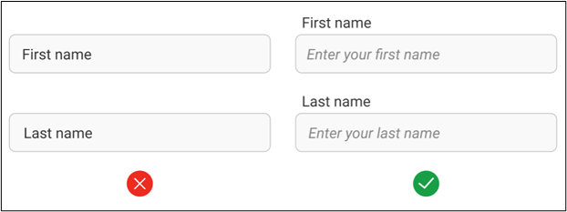
Always use labels
A label is premarked in a data form and informs the user what information or data must be entered in that particular field. Many designers use placeholders as labels to make the input and form cleaner. But it is not correct from the UX point of view because while entering data, the placeholder will vanish due to which the user may lose the track of the field.
-
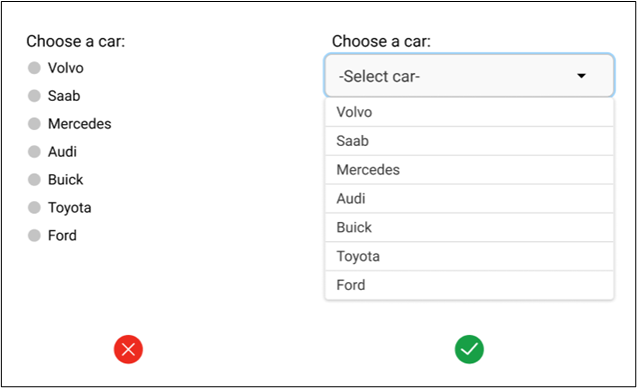
Automate as much in the input types. Use them right
One issue that most designers overlook while designing a form is selecting the correct input type. As shown in the example below, when the number of choices is large, it makes more sense to provide the select input option instead of the radio input as it will save space in the form and make it easy to track the selected choice. Hence, it is crucial to consider input structure while selecting the input type.
-
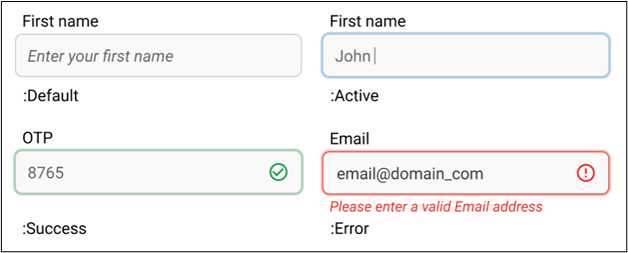
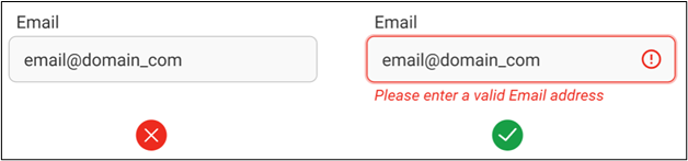
Indicate the current state of fields via feedback
Feedback is the essential element of a good UX, but surprisingly it is missing from many forms. Showing the correct state of the form elements is vital because it helps in making the data form more accessible and user-friendly. Like in the example below, the user can easily perceive through the field feedback that they must provide a valid email address to proceed with submission.
-
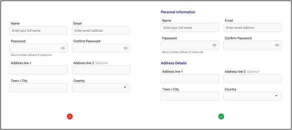
Grouping of associated fields for better accessibility
Grouping related fields into semantic blocks or sets will make more sense to users and enhance the overall experience. Also, adding some additional space or titles between different data sets will aid users in scanning the form in pieces like paragraphs instead of one large block. Hence, providing more clarity and structure.
-
Alert with loud and clear error messages
Error messages are essential feedback for users to understand what went wrong with their input. A clear error message will help the user to identify the problem and fix it. In addition to this, error messages ensure that the collected data is accurate.
-
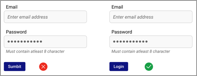
Correct action buttons are important
Task-specific actions buttons are far better than vague action buttons. It is necessary to give users the proper context about what the button does when they click on it. So don’t confuse users with generic names for action buttons.
-
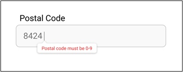
Show constraints in the feedback
Showing the error message about input constraints after submission can frustrate the user. The best way to ensure that users enter values as per the pre-defined criteria is through messages while they are providing input. For example, 0-9 digit constraint in numerical fields does not allow the user to enter alphabets in the field.
-
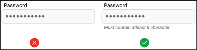
Helper text or ghost text to guide the user
Helper text provides more instructions about the form fields and helps users while they are inserting input. Like a minimum character, mandatory use of a unique symbol, and a capital letter helper text are given to users while creating new passwords. Hiding it in the tooltip or not using helper text is not recommended. Instead, the helper text should be visible with the form field itself.
-
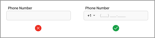
Use input masks
Input masks help users to understand the input format better. How does it help, you ask? Without input masks, users have no option other than entering data multiple times to get the correct format. The absence of input masks in relevant data fields can frustrate the users and impact data collection.
Conclusion
These basic UX design fundamentals will make the data form extremely user-friendly and boost its data capturing efficiency. I hope my insights based on experience gathered over the years will help you design forms that drive results. You can reach us out here and share your thoughts on this blog or provide more inputs.
Mohit Bairwa
Mohit is an engineer turned self-taught Illustrator and Visual Designer who likes to leave people agape with his minimalist style of designing. He is a B.Tech graduate in Computer Science, but his love for video games and digital artwork made him explore the trippy world of graphics and animation. In his spare time, Mohit likes to stay updated with the new design trends in UI/UX through articles, communities, and blogs.